Side projects
I build things, so I know what I’m asking engineers for.
My day job is deciding what gets built. On my own time I build things myself, and lately I direct AI to do the building. Partly because it’s fun, and partly because it keeps me honest about what “just add a button” actually costs.
This site is a side project. Meta, I know.
I ran this rebuild like a product: rules first, three design options, about eight review rounds and every number checked. AI wrote the code and drew the pictures. I made every call.


How I ran it
- Rules before code. Before any page, I had AI write a rulebook (voice, real numbers only, what’s confidential, the look) that every agent read first.
- Discovery, then decisions. An agent audited my old site and notes and came back with about 60 questions only I could answer. AI drafted the copy from my answers.
- Options, not opinions. Three agents built three design directions in parallel. I picked one and ran about eight rounds of feedback on it.
- When feedback is hard to put into words, build a tool. I had AI build a slider playground for buttons and an approval page for 112 copy edits, which is now a skill I reuse.
- Research before taste calls. For the page turn, an agent researched what makes a click feel good and filmed a prototype frame by frame before I said yes.
- Check everything. Every number traces to a source, and every page scores 100 on Lighthouse’s accessibility check.
Built with: Astro and Claude Code, hosted on Cloudflare Pages.
My dream company is hiring? Crap.
A tale of wanting to impress while under great distress. How hard could it be to build a Rails app in 5 days?
37signals posted a junior Rails developer role. I’d planned to learn Rails eventually and apply in a few years. I was working in .NET at the time, and my only previous run at Rails had ended in a pile of routing errors. Then the posting went up, and “eventually” turned into “this week.”
The constraint. Five days, close to zero Rails knowledge and an application window that was closing fast. I’d already spent days on the cover letter.

The call I made. My first idea was a proficiency tracker for homeschooling families: state standards by grade level, with progress tracking for each kid. Good idea. Wrong deadline. I cut it and built something I could actually finish: a candidate tracker for hiring managers. It was relevant to the team I was applying to, small enough to ship and big enough to teach me real Rails. It also had room for some personality.
From there, scope stayed tight on purpose:
- One model. Candidates, and that’s it, so I could ship the core before the deadline.
- Statuses that admit how hiring really works. I started with the usual “reviewing” and “phone interview.” Boring. Hiring is way more subjective than we like to admit, so the statuses describe how you feel about a candidate, all the way down to Hell no.
- Status is the whole point, so it’s everywhere. You can change it from three different places, and the list sorts from most to least likely to hire, with “undecided” at the bottom.
- No page reloads. Status updates happen in place, using Turbo and partials instead of a JavaScript framework.
I sketched the screens on the back of a meeting handout. The deploy fought me harder than the code did: my Windows setup kept throwing a Docker error, so I finished on a friend’s borrowed Linux machine.
What shipped in 5 days: create, edit and delete for candidates, login and registration, live status updates, a responsive layout with dark mode and a production deploy on DigitalOcean. The app is offline for now while I revamp it, so the code is the place to look.

What I’d build next, in priority order:
- Multi-user support, so a whole hiring panel can evaluate candidates together. Hiring is a team sport, and right now this app has one player.
- Evaluation scores for communication, technical skills and culture fit, so “Hell no” comes with reasons.
- Easier attachments: add and remove files from the candidate page, with visible file names.

Epilogue: I made it to the second round, one of only a handful of candidates. I didn’t get the job, but the project did its job. And I learned I really like Rails.
Trying to make a senior capstone that doesn’t suck
I refused to build a Pokémon card inventory. I built a room reservation app instead.
Every capstone needs a problem. I picked one with real edge cases: businesses that rent rooms by the hour for things like conferences, receptions and community gatherings. Hourly bookings are where the double-booking headaches live.
The business problem was my assumption. I looked at how a few local businesses handled bookings, but I never talked to any of them. A real version of this would start with those conversations.
The constraint. A school project with no real users. That meant the requirements had to come from me, and the work had to prove itself through design and tests rather than adoption.
The call I made. I ran it like a product: requirements first, then a data model, then wireframes, then code, then tests. The core rule was simple. Two reservations can’t overlap in the same room. Everything else (rooms, customers, reports) is built around protecting that.
- Data model before screens. Rooms, reservations and customers, with reservations built on a general “booking” type so other booking types could be added later.
- Consistent screens. I designed the key screens in Figma with the same table layout and search placement everywhere, so learning one screen teaches you the rest.
- Guardrails in the data. A room with reservations on it can’t be deleted.
- Tests on the rules that matter. Seven unit tests cover the date, guest-count and overlap rules.
What I’d build next: recurring bookings. The tests don’t cover them yet, so they don’t count as done.
A few things I designed for Tech Handoff clients
I owned design as well as product at Tech Handoff.
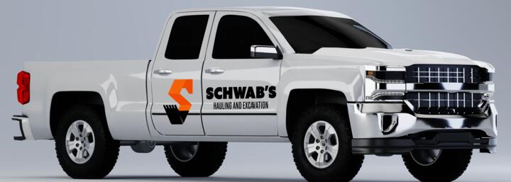
Truck magnets nobody asked for. Schwab’s Hauling and Excavation, a snow-plow client, wanted a brand guide. I pitched truck magnets too, and they went for it.
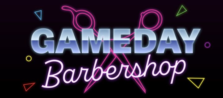
A barbershop called Gameday, styled like an ’80s concert poster. Four signage concepts for a shop in Wyoming that mix classic barbershop details with retro rock-band promo style.
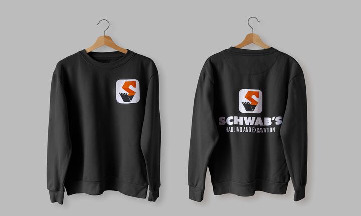
Merch for the crew. A sweatshirt and ballcap for Schwab’s, part of their branding package.


